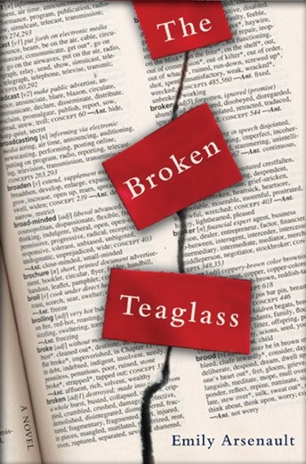
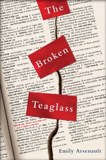
The original comp is on the top left, you can see how far the designer took the idea. The changes requested were to alter the printed page background from a Thesaurus to a Dictionary looking image. Also they wanted the word ‘novel’ to be incorporated into the background type right below the title in red to make it stand out. Then
the cut down the middle of the book needed to be made more three dimensional and the red ribbon more believable. Notice the close-up directly to the left. The entire page of the background had to be typed out by hand to make everything place perfectly.